Interior color is the most economical way of transforming a room into style. To most, choosing a color can be a bit daunting especially if you are stuck having no idea on how to go about it. Walls create a big difference to the appearance of a room. Choosing the right color is a bit tricky but a well chosen one plus its accent colors can be very rewarding. There is no doubt that it can draw attention to interior detail flaws.
It is important that you know the relationships of these colors and how they are created. Warm colors are made with red, yellow, orange and a combination of these which makes us think of sunlight and warmth. On the other hand, cold colors give us an opposite effect of warm colors. As a general rule, the more blue, the colder the color is. Cold colors are made with blue, violet, green and a combination of these.
 |
| COLOR WHEEL |
COLOR SCHEME
Analogous - A color scheme closely related to each other. These are colors that are next to each other in the color wheel. They usually match well and can exude a serene and comfortable feel. If you opt for this color combination, make sure to make one color dominant to provide focus and use the other colors as accents.

Achromatic - It is a scheme possessing no hue; using only black, white and gray. It is a neutral color and can be combined with any color as accent to the room. This color is often used in kitchens and bathrooms but can also be used in living rooms. This scheme has a strong contrast.
 |
Complimentary - These colors are opposite from each other in the color wheel. A certain skill is required in placing these colors into the interior to achieve a harmonious balance. The high contrast of complimentary colors gives a vibrant appearance especially in full saturation.

Monochromatic - This is created by using any shade, tint or tone of one color from the color wheel. This can give a very restful and relaxing atmosphere. For smaller spaces a light monochromatic color scheme really enhances the appearance of a room.

Split Complimentary - is created by selecting one color from the color wheel, then use one color either side of its complementary color (blue, green and red). This often provides a more pleasing color scheme than a true complementary as it is still a strong contrast but not as intense.

But of course, you can always create your own color combination but make sure that they are not of the same vibrant intensities as these may become a sore in the eye. You just have to be creative. White can be combined with other colors; which can give an elegant effect to the atmosphere. You can use black and white and add a color as an accent to make it interesting. There is actually no hard rules when it comes to color combination. Just don't over do it and you'll be fine.
 |
| Black and White accented with Purple |
 |
| Blue and Yellow |
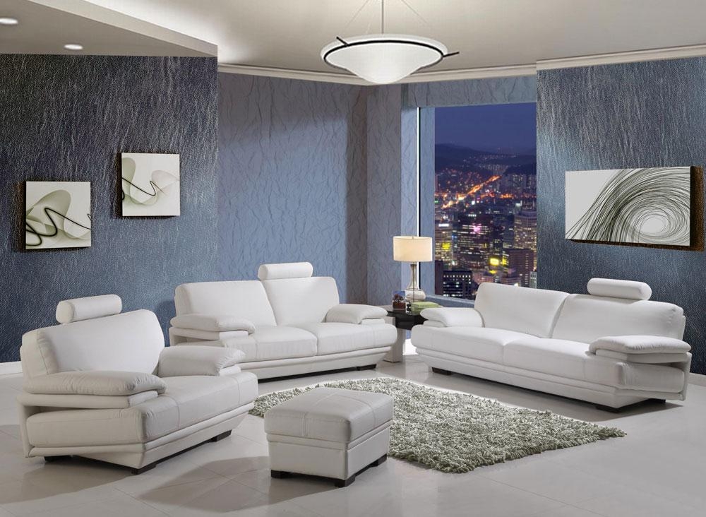 |
| Blue and White |


No comments:
Post a Comment